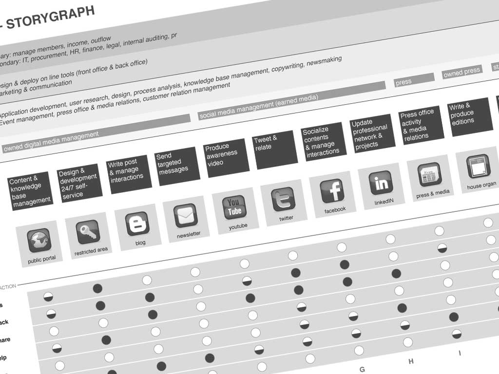
The storygraph is a deliverable I made to visualize the user needs/touchpoint matrix.
Then it became a powerful tool, but let’s start from the beginning.
Two years ago I was trying to represent how people interact with a whole system, over time and space. Call it by other names: cross-channel experience design, multi-channel service design, extended customer relationship management, touchpoint map, customer experience. We’re talking moreless the same language.
Let’s think about the customer’s journey. As designers we can’t have control over the path our customers walk. They can approach us from any possible touchpoint: our website, some else’s website, phone, friend advice, our headquarter or any other physical location, remote help desk, social media etc. They use whatever they will to get informations or complete a task. From the customer’s point of view, they’re just interacting with our brand. And they don’t care about what channel or system or device they’re using. That’s exactly why we have to.
Step 1
I started creating a flat service inventory: no hierachy, just a simple list of product & services people want form us. For example in the banking market it could be:
- apply for a credit card
- buy traveler’s checks
- cash a check
- check your account balance
- deposit money
- exchange money
- withdraw money
- open a checking account
- open a savings account
- order checks
- pay off a loan
- pay your bills online
- rent a safety deposit box
- take out a loan
- talk with a bank teller
- talk with the bank manager
- transfer money
- apply for a debit card
- renew a debit card
- substitute a damaged debit card
- raise the budget limit of the debit card
- …
If your business is not so small the list of products & services will be huge. So I recommend you to cluster them by user needs, using insights coming from user research (surveys & stories), marketing (sales) & customer relationship (faq, open/closed tickets) data. A possible cluster could be:
- Core services (credit & finance, receipts & payments, savings etc)
- Send feedback (suggestions, compliments, complaints)
- Discuss or share opinions
- Ask for help
- Networking (know pairs or partners)
- Discover news
- Know in depth (to delve deeper into some matter/offer/question/issue)
Step 2
Then I identified the touchpoints where the user interacts with our company/product. It was easy to create a grid with touchpoints along the top and services as rows, and fill in the details. The result was pretty close to this slide of a presentation made by Jess McMullin and Samantha Starmer during IA Summit 2010:

Step 3
After a month I saw the service blueprint designe by Bandon Schauer for Adaptive Path.

I was totally amazed. The idea of separation between what is visible to the user and what is hidden in the backstage gave me new material to retink my deliverable. I started tracking corporate processes & activities provided to build and shape the touchpoints. I added the lines (visibility, interaction, internal interaction) to separate all the operations carried out by people & systems that are not in direct contact with users (support processes) from visible activities.
Step 4
During 2011 fall I published an article on the Journal of Information architecture and I found Connecting the dots of user experience in a past issue. Gianluca Brugnoli gave me the inspiration to create dots, half dots and empty dots in the matrix.
And finally: the storygraph
Here’s the current version of my deliverable, made for a fake bank company, with a imaginary set of touchpoint.

Chapter 2: Using the storygraph as a tool
Thanks to
Andrea Resmini – Designing Cross-channel user experiences
Luca Rosati, Andrea Resmini – Pervasive IA
Richard Dalton – Experience Strategy: Dealing With a UX Mid-Life Crisis
Jess Mc Mullin – Reinventing Government
Service design tools


Great tool! Thanks for sharing. I’ve been looking for a good CX Experience Tool. BTW, the ‘dots, half dots and empty dots in the matrix’ are called Harvey Balls: http://en.wikipedia.org/wiki/Harvey_Balls.
This is fantastic, thanks for sharing, Raffaele. I’m keen to try this on an upcoming project.